Flex-Box

Introduction
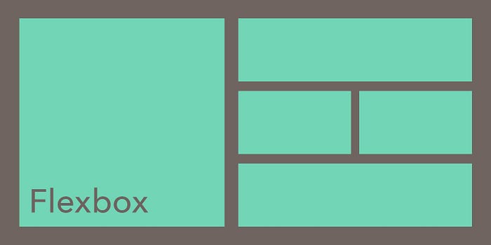
It is used to create a layout for a webpage. It is used to arrange elements of the webpage to create a beautiful customized page layout. According to screen size, flexbox layout gets arranged automatically, we can make our web page responsive without using a media query. Flex-box uses two-axis horizontal and vertical using these elements can be arranged. Flex items are good at managing spaces and moving around with other elements.
Fundamentals of css flexbox
To make elements flexible, first, it’s parent container display property should be assigned to Flex. By default Flex items direction are horizontal from left to right and also direction can be changed from top to bottom. Flexbox is known as a one-dimension system, elements can be horizontally or vertically direction only.
Flexbox properties
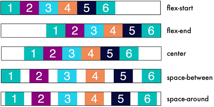
- Justify content: This is used to modify the distribution of flex items horizontally, five different options are there
a) flex-start: left-justified
b)flex-end: right-justified
c)center: centered
d)space-around: equally space distribution surrounding the box
e)space-between: equally space distribution between the space

2)Flex direction: This property is used to arrange flex elements in columns and also to reverse the direction.
eg: .flex-container { display: flex; flex-direction: column; }
a)row: from left to right
b)row-reverse: right to left
c)column: top-down
d)column reverse:bottom-up

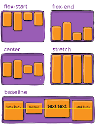
3)align-items: This is used to modify the distribution of flex items vertical, the combination of align-items and justify-content can be used to move elements in the center of the parent container, five different options are there
a)center:elements are centered
b)flex-start: placed on top of the parent container
c)flex-end: placed on the bottom of the parent container
d)stretch: elements become the same-sized
f)baseline: all elements are arranged in a baseline

4) flex-wrap: This property is used to wrap the flexible item to a new line when required or else need to scroll in a horizontal direction.
a)nowrap: no line break
b)wrap: line break when required
c)wrap-reverse: line break but in reverse order.
eg: .flex-container { display: flex; flex-direction: row; flex-wrap: wrap; margin-bottom: 25px; }

6)order: flex items are arranged in the same order as they are defined in the Html document, by using order we can customize the order of elements in the parent container. By default, every element is ordered value is 0 if a higher valued item is present then it will be placed at end of all elements.
